Keep the product in context
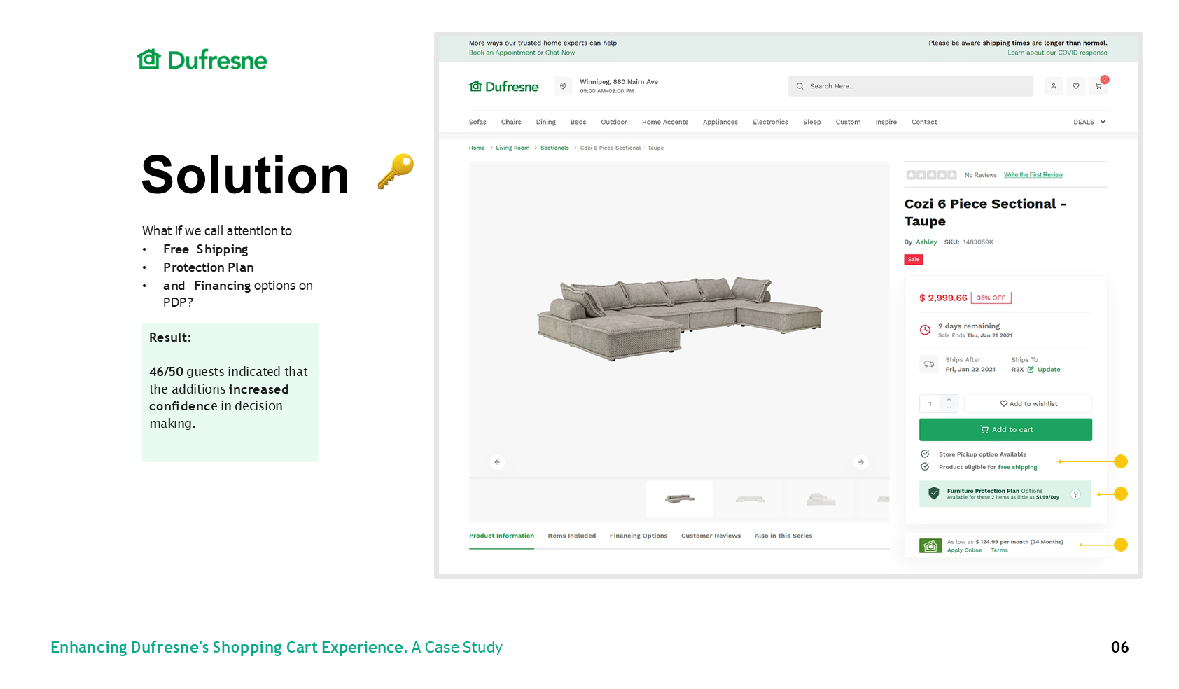
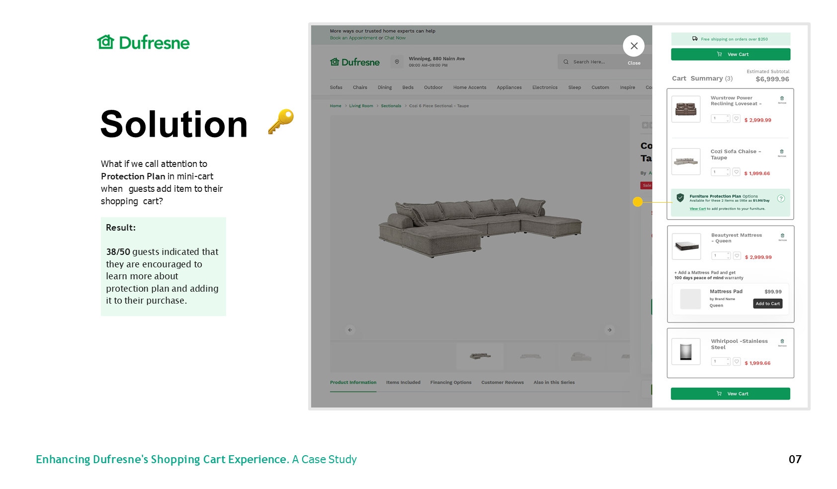
Service and protection choices were presented beside the item instead of sending customers into disconnected pages.
Dufresne · 2022
I redesigned key moments in Dufresne’s furniture-buying journey so customers could understand services, financing, and delivery without losing momentum.
Project brief
01 / Challenge
Furniture is a high-consideration purchase. Customers need to understand financing, availability, delivery, protection, and support before they feel ready to commit. These decisions were spread across the journey, creating uncertainty at the point of purchase.
02 / Evidence
Customer support was frequently needed mid-purchase
The source material identified high cart abandonment as a core problem
Business goals focused on increasing service visibility, converting more paying customers, and reducing unnecessary click-throughs
03 / Approach
I mapped the full path from product discovery to post-purchase service, identified where questions became blockers, and worked with product, engineering, and operations to separate essential decisions from secondary information. Concepts were iterated in short cycles against customer and business needs.
04 / Key insight
Customers were not asking for more information. They needed the right information, in plain language, exactly when the decision became consequential.
Service and protection choices were presented beside the item instead of sending customers into disconnected pages.
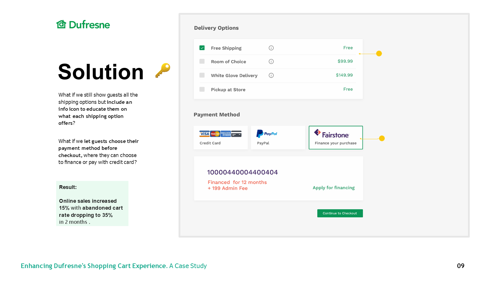
Financing, delivery, and add-ons were introduced when relevant so the main purchase path stayed legible.
A consistent panel and hierarchy reduced relearning across product detail and checkout.
05 / Solution
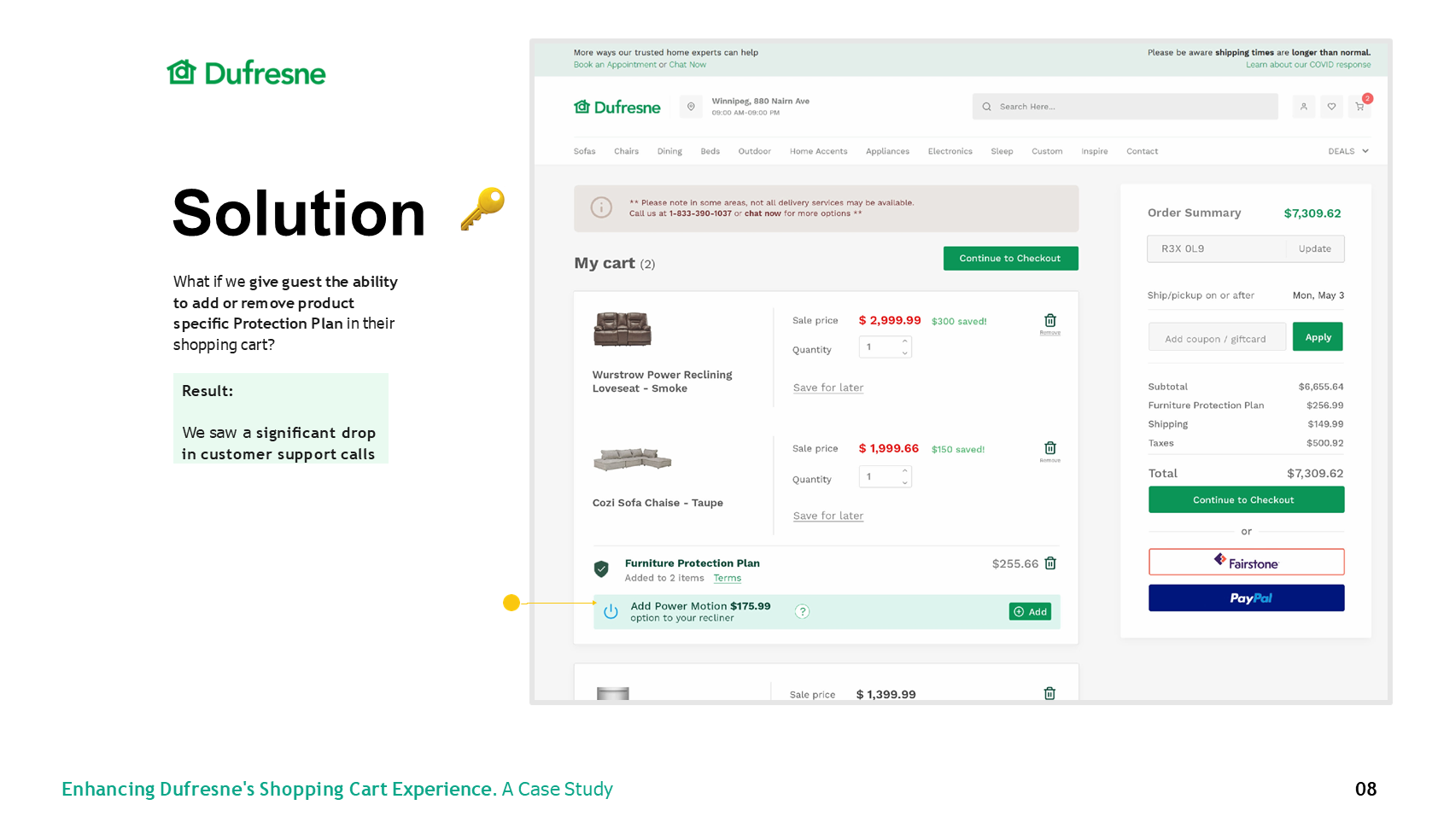
The redesigned experience brought service options, financing, delivery expectations, and support into one coherent hierarchy. Reusable commerce patterns made the purchase path consistent across desktop and mobile while keeping the primary action unmistakable.
Constraints
Collaboration
I worked across product, engineering, and operations to translate service rules into a customer-facing hierarchy. The design balanced clarity for customers with information the business was required to surface.
06 / Outcome
A clearer path from product choice to delivery
The supplied source material does not include a quantified post-launch result. The case study therefore reports validated experience improvements without claiming a conversion lift. The next measurement plan would track cart completion, service attachment, support contacts, and checkout exits.
07 / Reflection
The strongest design move was not adding another feature. It was sequencing existing information around the customer’s decision-making rhythm and making operational complexity feel calm.