Choose one invitation
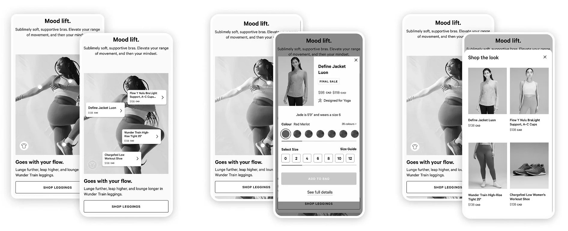
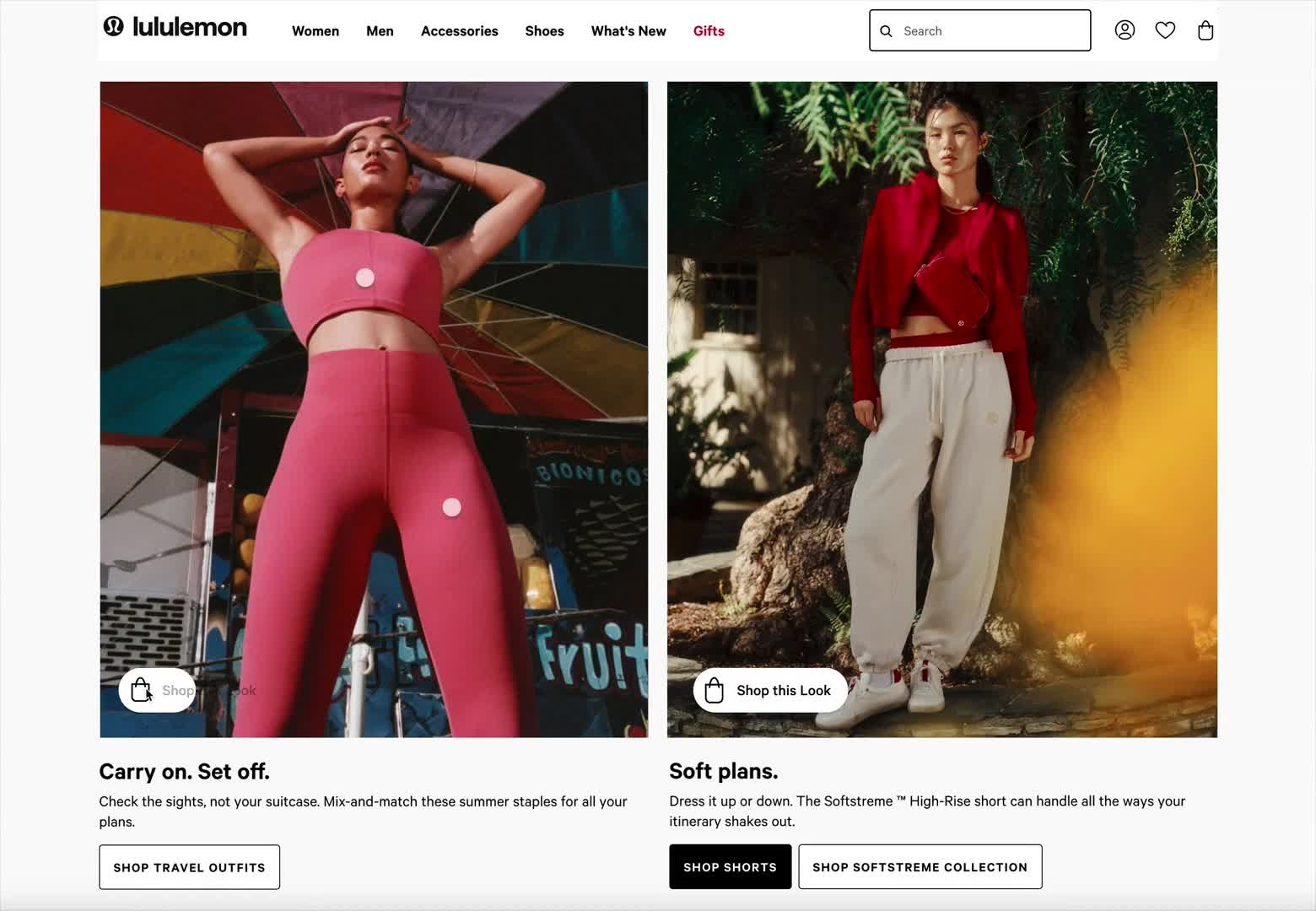
Guests recognized product hotspots; a second shirt icon suggested a competing route and reduced confidence.
lululemon · 2024
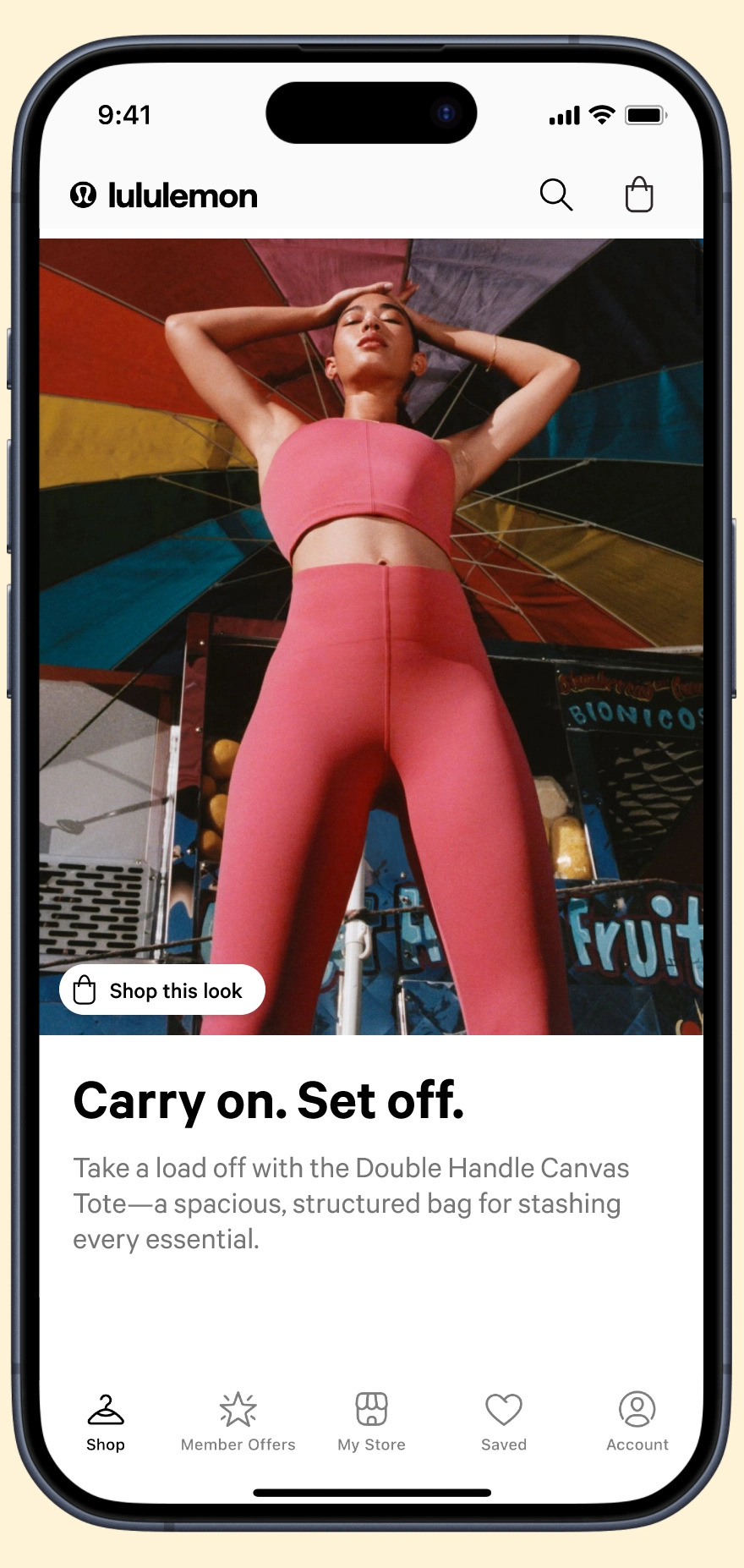
I designed an accessible shoppable-image system that let guests identify and buy products directly from campaign imagery—without breaking the story.
Project brief
01 / Challenge
Campaign images created desire, but guests could not easily identify what the model was wearing. The handoff from inspiration to product discovery was broken, forcing people to search for items they had already decided they liked.
02 / Evidence
Six moderated usability sessions with lululemon guests in the US and Canada
A 100-participant first-click study across genders and online-shopping behavior
Three accessibility interviews covering screen readers, magnification, and alternative navigation
03 / Approach
I partnered with research on six moderated usability sessions, a 100-participant first-click test, and accessibility interviews with screen-reader, magnification, and alternative-navigation users. We validated the interaction model before refining the visual components.
04 / Key insight
Product hotspots were immediately understood. A competing shirt icon suggested a second path and introduced uncertainty—one strong invitation worked better than two weaker ones.
Guests recognized product hotspots; a second shirt icon suggested a competing route and reduced confidence.
The CTA explained the interaction before hotspots appeared, preserving the image until a guest chose to shop.
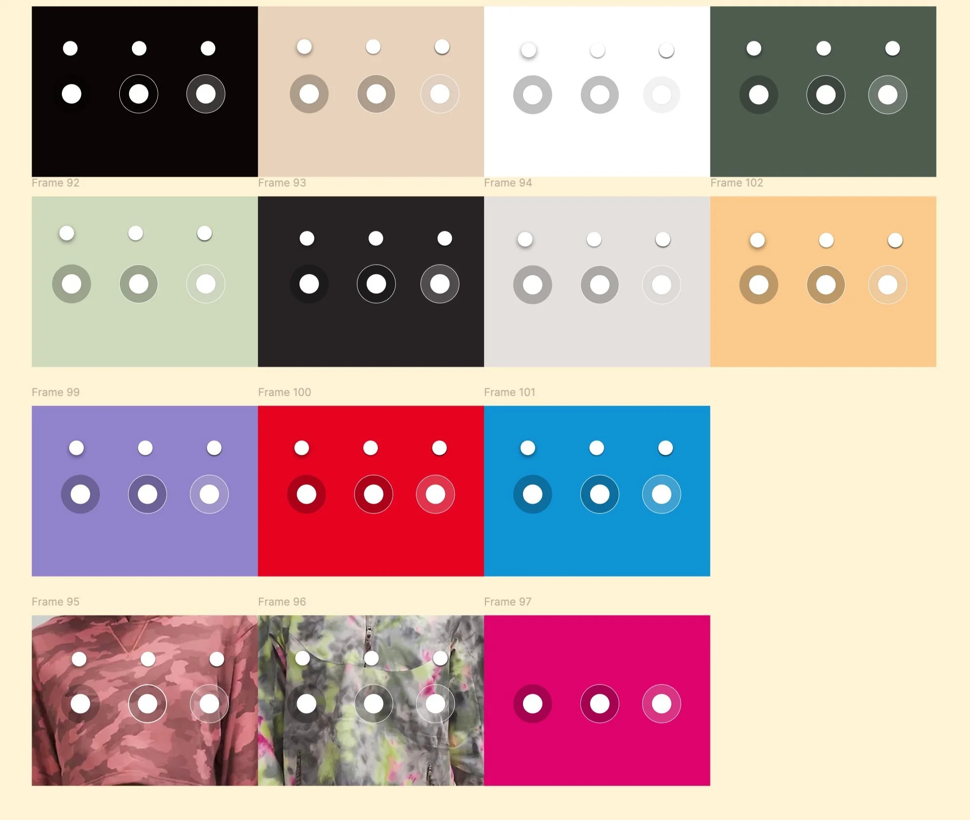
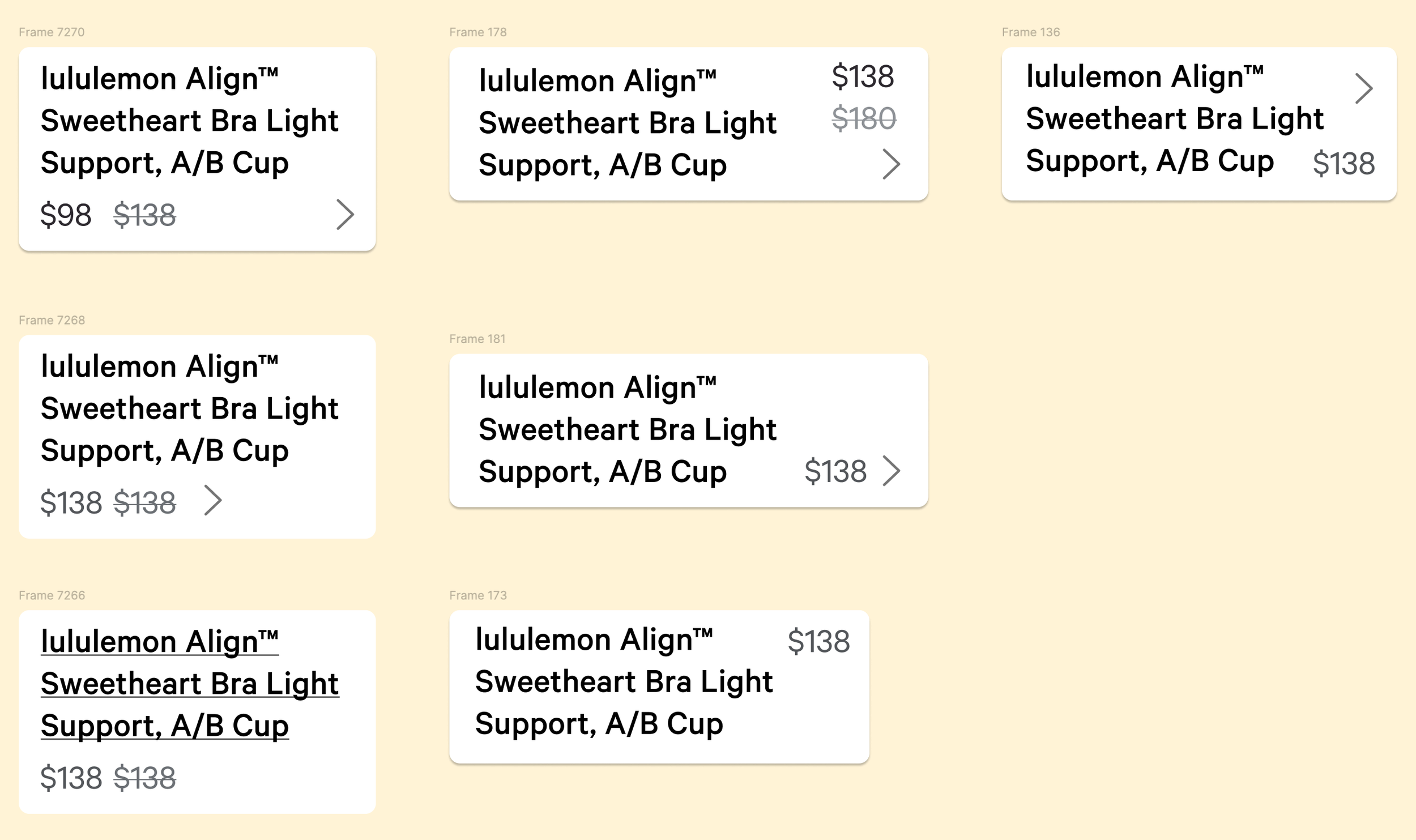
Widths, stacking, type, and focus behavior were defined for mobile, desktop, and assistive technology.
05 / Solution
A three-part system combined a progressive-disclosure CTA, accessible hotspots, and responsive product tooltips. The pattern kept the campaign image visually dominant while making every featured product discoverable, understandable, and purchasable.
Constraints
Collaboration
I partnered with UX research to validate the model, accessibility specialists to define assistive-technology behavior, engineering to resolve responsive constraints, and the design-system team to establish a new pattern while retaining approved type variables.
06 / Outcome
$6.4M incremental revenue across web and app
Reported post-launch results: campaign-image engagement increased 33.6%; two in five engaged guests purchased one or two featured products; incremental revenue was reported as $4.4M on web and $2M in app.
07 / Reflection
This work reinforced that accessibility belongs in the interaction model, not at the end of visual design. Early input from assistive-technology users shaped a simpler experience for everyone.