Show a complete look
A structured flat lay communicated the relationship between the seed item and supporting products more clearly than a generic row.
lululemon · 2025
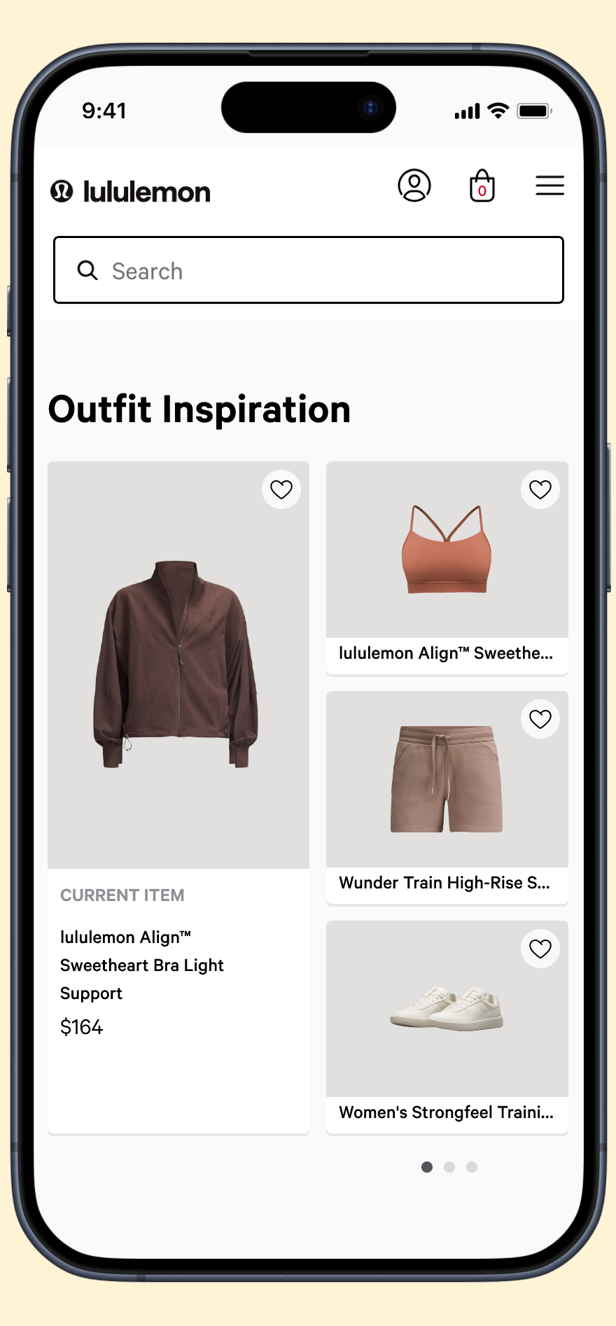
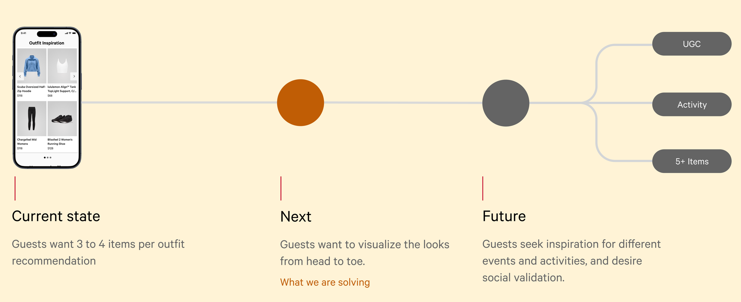
I redesigned an AI-assisted outfit component so guests could understand a complete look at a glance and confidently shop more than one item.
Project brief
01 / Challenge
The existing outfit module was visible but underused: engagement was 2.35% on web and 1.6% in app. Products appeared as recommendations, but the interface did not help guests visualize a coherent head-to-toe look.
02 / Evidence
Baseline engagement was 2.35% on web and 1.6% in app
Guest needs clustered around versatility, styling education, and confidence for an activity or occasion
Concepts were generated in a workshop, grouped into five experience types, and sorted toward a preferred direction
03 / Approach
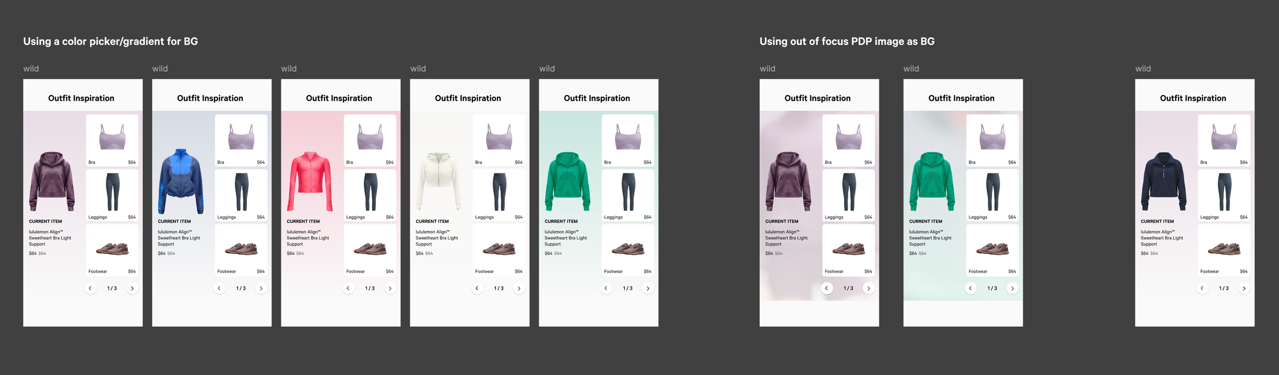
I led a concept workshop, organized ideas into five experience types, and evaluated them against three guest needs: versatility, styling education, and confidence for a specific activity or occasion. Exploration covered outfitting rules, hierarchy, accessibility, and future scalability.
04 / Key insight
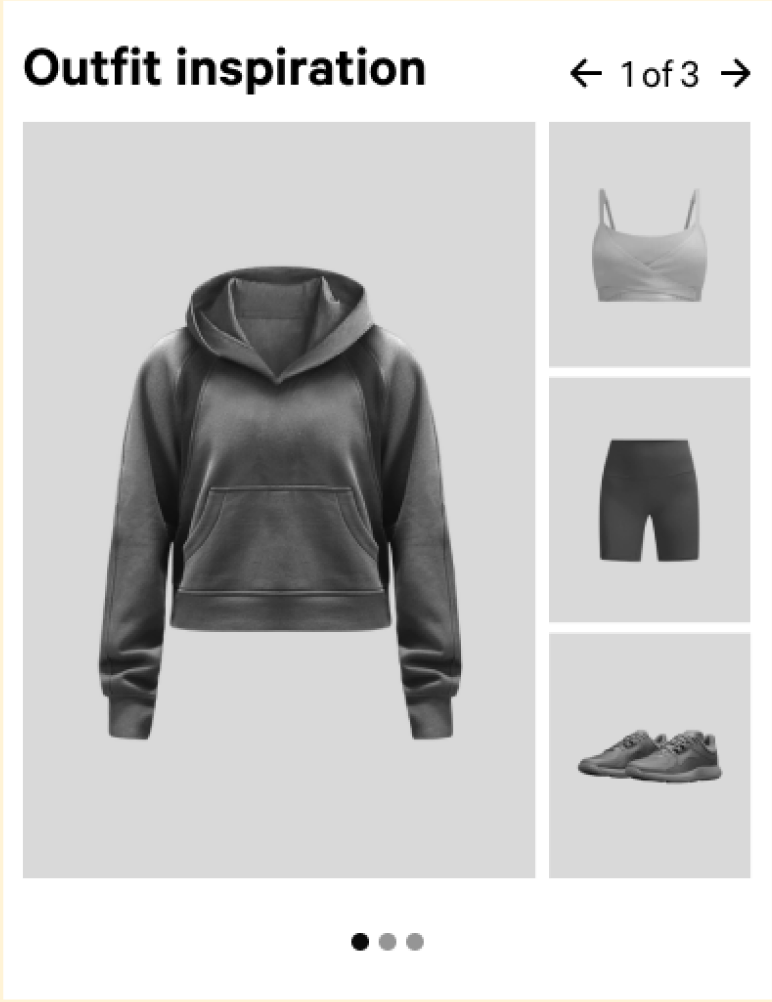
Guests wanted an outfit idea—not a row of related products. The relationship between the seed item and every recommendation had to be immediately visible.
A structured flat lay communicated the relationship between the seed item and supporting products more clearly than a generic row.
The seed product remains visually primary while recommendations read as one coordinated outfit.
Modular slots allow recommendation strategies to change over the next 12–24 months without replacing the interface.
05 / Solution
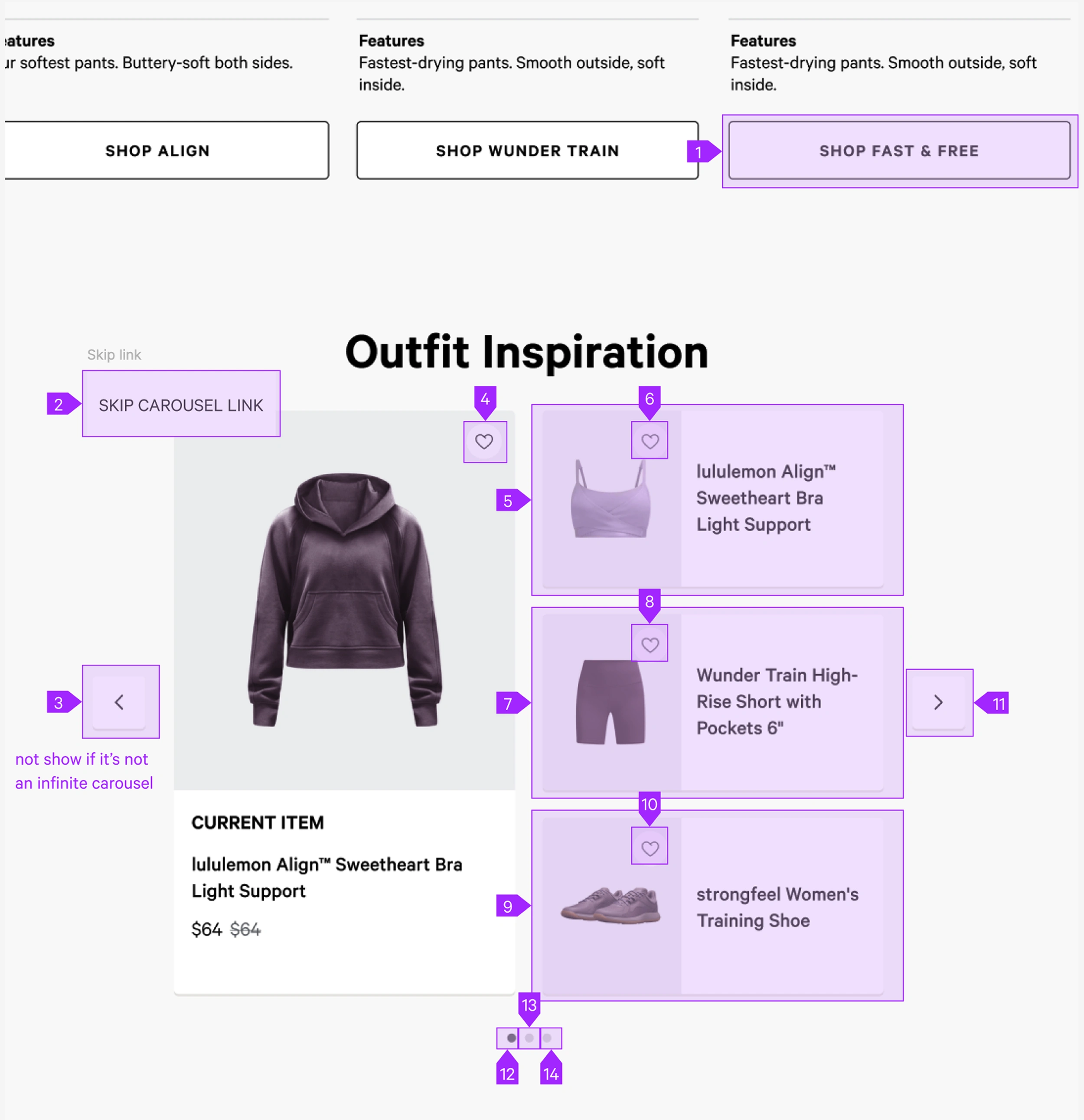
A structured flat-lay grid establishes the seed item first, then organizes complementary products into a complete look. Accessible carousel behavior and modular content slots allow future recommendation strategies to plug in without redesigning the interface.
Constraints
Collaboration
I led concept generation and sorting, partnered with research on guest needs, worked with machine-learning and engineering partners on content variability, and documented accessible focus behavior for carousel arrows, pagination, and skip links.
06 / Outcome
Engagement increased from ~2% to 5%
The source reports engagement increasing from roughly 2% to 5%, alongside more multi-item purchases through the component. The source does not specify the evaluation window, so the case study avoids implying a precise causal attribution beyond the reported change.
07 / Reflection
Designing for machine-generated content meant planning for inconsistency. Clear rules, resilient layouts, and useful empty states mattered as much as the ideal-state composition.